The look was frosted colour. The starting point was clear.
We responded to a coloured retail-block brief with a proposed combination of reverse printing, white backing and sandblasting, using separate historical references to explain each effect.
Three requirements in a small retail block.
A buyer asked us in January 2026 to quote 100 coloured acrylic blocks measuring 3 × 3 × 0.5 inches, with a frosted appearance and a graphic printed on the front. The client’s example images showed the intended visual direction; final artwork was still to come.
We explained that the requested combination of thickness, colour and frosted stock was not generally available in our proposed supply route. We therefore described a process that would begin with clear acrylic and build the appearance through separate operations.
- Inquiry quantity
- 100 pieces
- Requested format
- 3 × 3 × 0.5 in
- Artwork at this stage
- Not yet supplied
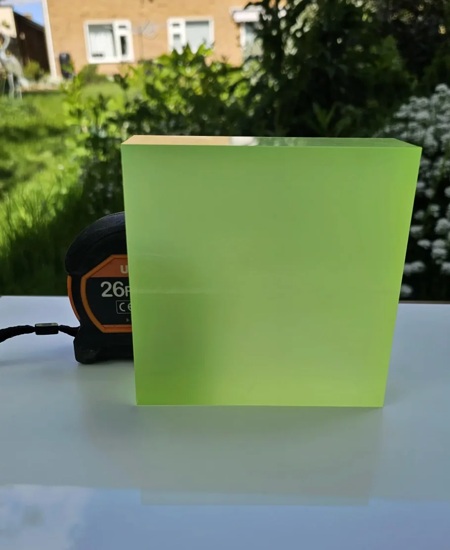
Start clear. Add the colour and surface separately.
- 01
Clear material
We proposed nominal 12 mm clear acrylic as the starting material. This was the quoted route for the half-inch brief, with final specifications still to be agreed.
- 02
Reverse colour
We described printing the requested colour on the back, followed by a white backing layer.
- 03
Frosted surfaces
We proposed sandblasting the other surfaces to create the softer appearance discussed with the buyer.
- 04
Front graphic
The proposal then called for a silk-screened logo on the front, once the artwork was available.
This sequence summarises our proposal in the correspondence. It is not a tested specification or a record of a completed sample.
Two photographs explained two separate effects.
The buyer asked for a photograph of the finished combination to show the client. We replied that we did not have a photograph showing all the proposed processes together on one block. Instead, we shared earlier product photographs that demonstrated the effects separately.
That distinction kept the reference useful. One product illustrated colour printed behind clear acrylic; another showed the sandblasted appearance. Neither photograph established how the complete new brief would look once made.
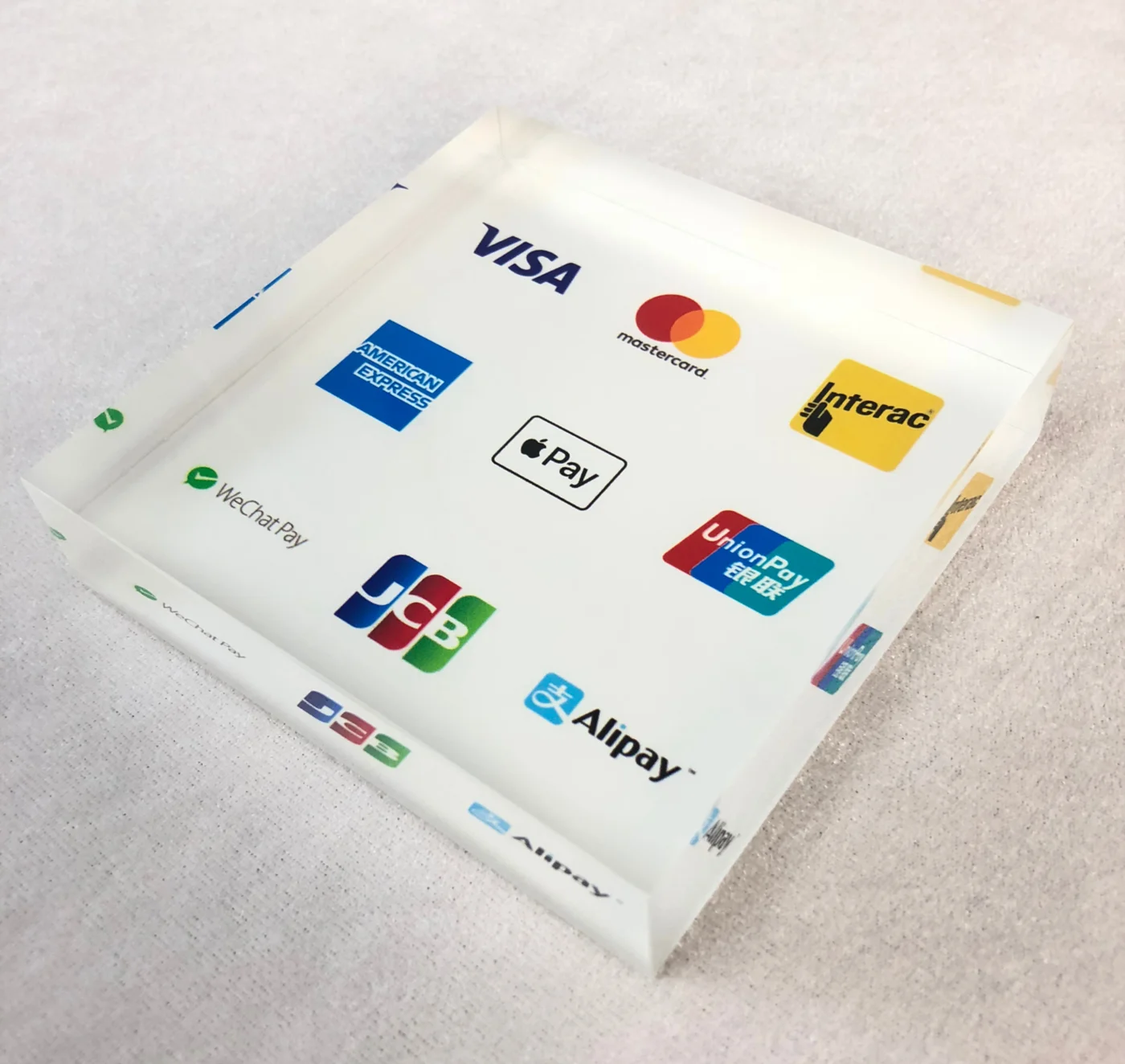
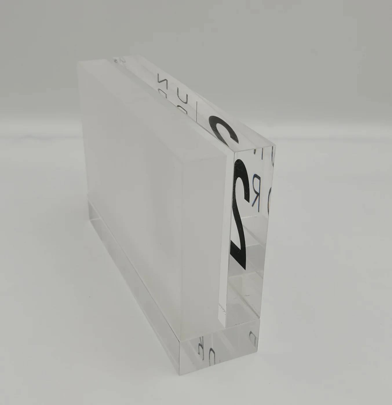
The complete effect needed its own review.
The exchange ends with the process explanation and reference images. We have no order confirmation, approved sample or delivery record for this inquiry.
For the next step on a similar brief, we would ask for the actual front artwork and intended colour, then review the combined appearance on the agreed material. That would give the buyer one coherent reference for the colour, frosted surfaces and printed face.
Explore clear and frosted acrylic appearances