A soft gradient, finished with white lettering.
We translated a beauty buyer’s lash-tile artwork into a product preview, carried the all-white lettering requirement through the design exchange and later reported production complete.
Quiet colour.
A clear printing instruction.
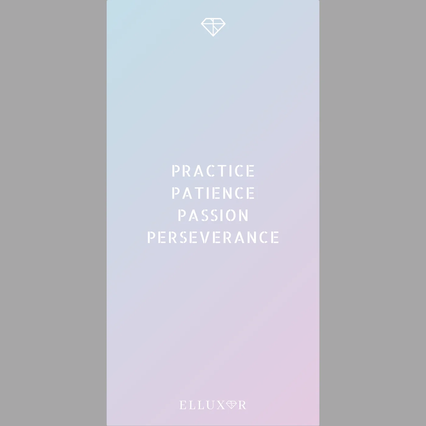
A beauty buyer supplied a lash-tile design with a pale blue-to-pink gradient, a small diamond motif and stacked wording. The accompanying instruction was short: print all of it in white.
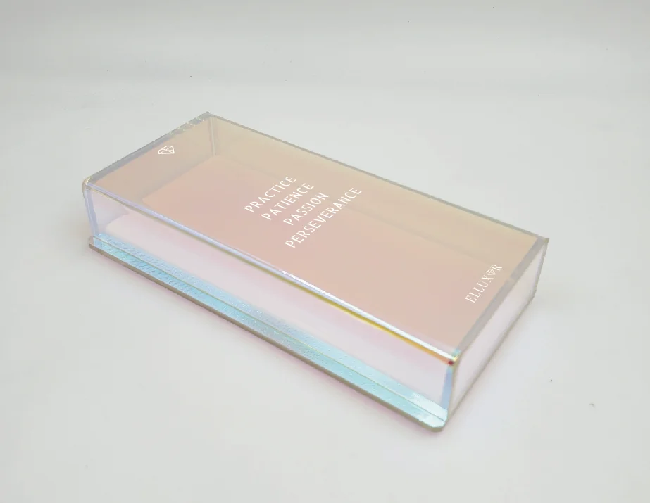
We used the supplied artwork to prepare a product preview. The February exchange focused on how the graphic would read on the proposed clear form, with the white motif, lettering and brand mark shown together.
One file established the visual direction.
The customer’s original file brought the colour field and lettering into a single composition. We kept that file beside the product preview so the discussion could refer to the same design.
The larger words and the small brand mark both belonged to the all-white instruction. At this stage, our useful contribution was to show the complete proposed arrangement and ask the buyer to confirm it.
Colour fieldA soft gradient supplied by the buyer.
Graphic colourWhite across the motif and lettering.
Product viewA preview returned for confirmation.
We returned the design preview.
We sent the product view and asked the buyer to confirm whether the arrangement was suitable.
We reported production complete.
Our next recorded update said the goods were made and awaiting shipping arrangements.
The artwork and the production update tell different parts of the story.
The two images here document the design exchange. The later email documents our production-complete update. We have kept those stages distinct because the archive does not include a finished-batch photograph, dispatch confirmation or customer receipt.
For another beauty accessory, we would begin with the buyer’s artwork and an explicit colour instruction, then use a product view to make the proposed placement easy to review.